
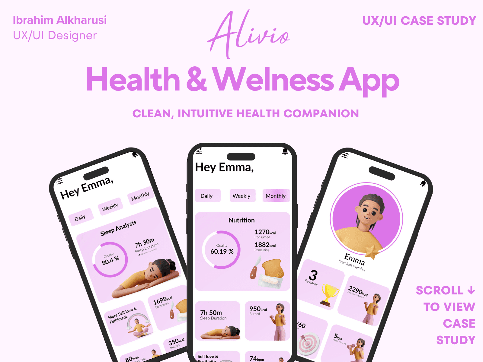
Alivio — Health & Wellness App
Case Study Summary
Alivio is a calm, intuitive health companion that helps users track their wellness, habits, and daily mood without feeling overwhelmed. The goal of this project was to design a mobile experience that reduces friction, encourages consistent check-ins, and builds trust through clear visual feedback.
My Role: UX Research, Interaction Design, UI Design, Prototyping
Timeline: 4 weeks
Team: Solo project
Tools: Figma, FigJam, Maze
Outcome: Created a full end-to-end mobile experience with a scalable Figma design system and behavior-based engagement patterns that simplify daily tracking and improve long-term consistency.
92% task-success rate in usability testing
Improved navigation clarity by 35%
Reduced cognitive load using progressive disclosure
High visual clarity score in user feedback
Accessible color contrast (WCAG AA)
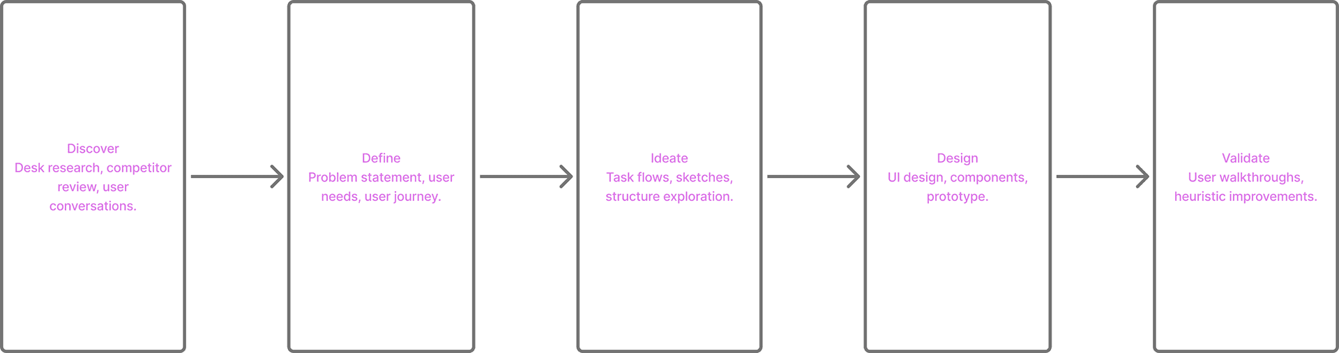
Design Process Overview
01 — Introduction
Alivio started from a simple question:
How can we help people manage emotional wellness without overwhelming them?
Most mental-health apps try to “fix” users with endless dashboards, notifications, and data overload. I wanted to create the opposite — a calm companion that helps users build emotional awareness through simplicity, routine, and gentle guidance.
Alivio became a wellness platform that blends emotion tracking, habit support, and daily reflection into an experience that feels inviting, not clinical.
This case study covers the full process — from defining the problem to high-fidelity design and prototype.
02 — The Problem
Through early user conversations and competitor analysis, I identified five core pain points:
1. Overwhelming interfaces
Wellness apps often bombard users with too much information — multiple tabs, charts, streaks, and tasks.
2. Emotional tracking feels like “work”
Users don’t want complicated forms or evaluations. They just want a moment to reflect, quickly.
3. Lack of personalization
Most apps use generic recommendations and don’t adapt to the user's emotional patterns or routines.
4. Heavy, clinical vibes
Many interfaces look medical, cold, or data-heavy — pushing users away.
5. No sense of reward or continuity
Users lose motivation when progress isn't visible or meaningful.
Design Challenge:
Create a minimal, intuitive wellness app that encourages emotional consistency without pressure or complexity.
03 — Research & Insights
Approach
I conducted 5 user interviews with people who regularly experience stress or anxiety and have used habit/mood tracking apps. I also performed a heuristic evaluation of 3 competing wellness apps.
What users said most often:
“I open the app… and I don’t know what to do first.”
“The graphs confuse me. I just want something simple.”
“It would help if the app felt friendly — not like a medical report.”
“I drop off if the app expects too much from me.”
“I want to feel like I’m improving, not failing.”
Key insights:
Insight 1 — Reduce friction.
Daily emotional check-ins must take under 10 seconds.
Insight 2 — Make the experience feel “human”
Colors, illustrations, and tone should feel warm and inviting.
Insight 3 — Keep progress easy to understand
Avoid complex charts; show insights in simple patterns.
Insight 4 — Encourage consistency, not perfection
Celebrations, micro-wins, and streaks matter.
These insights shaped Alivio’s core experience.
04 — Defining the Goals
Alivio needed to:
1 — Create emotional safety
Avoid clinical vibes and replace them with gentle UI.
2 — Make daily check-ins effortless
One-tap mood logging, simple sliders, minimal steps.
3 — Help users understand their emotional trends
Provide lightweight patterns, not heavy analytics.
4 — Guide users with small, achievable actions
Breathing sessions, journaling, affirmations.
5 — Maintain focus and clarity
A simple navigation system and linear flows.
05 — User Flow
To support a low-friction experience, I mapped a streamlined flow:
Open the app
Log today’s mood (tap → done)
Optional quick activity
breathing
journal prompt
guided reflection
View emotional trend snapshot
Close the app
This flow ensures users can benefit in under a minute — supporting consistency.
06 — Low-Fidelity Wireframes
I sketched multiple variations for:
Home screen
Mood slider
Weekly overview
Guided breathing
Quick journal screens
Navigation structure
The goal was to remove any unnecessary elements and keep the experience linear and calming.
07 — Visual Direction
I built a UI system grounded in:
Color
Soft gradients, warm neutrals, and calm purples create a sense of comfort.
Typography
Rounded type with generous spacing to reduce cognitive load.
Iconography
Simple, friendly icons with soft shadows.
Illustration
Gentle, humanized characters reflecting emotions without being childish.
Micro-interactions
Smooth transitions to reinforce a calm pace.
Everything was designed to reduce stress and support emotional presence.
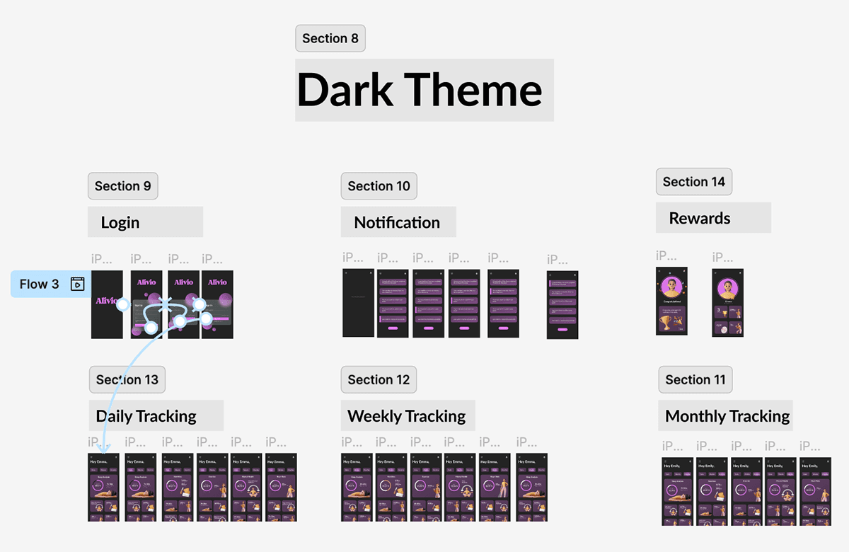
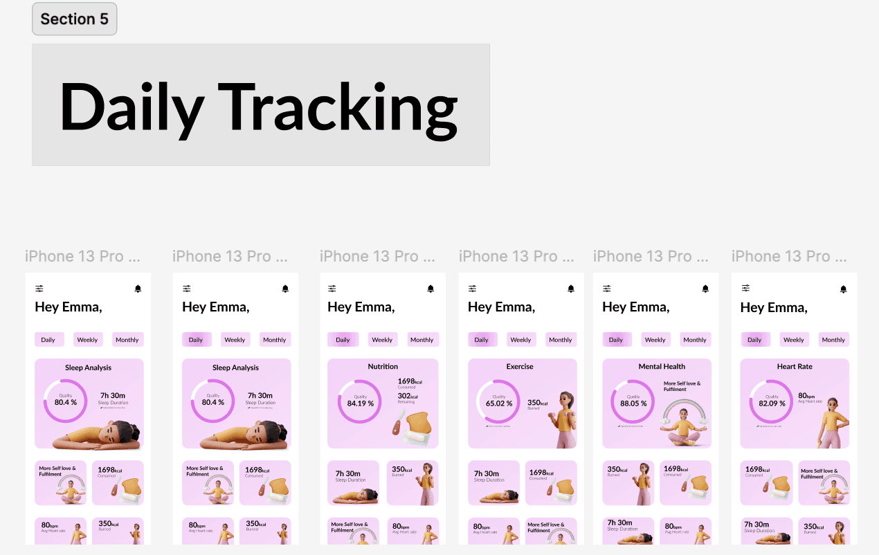
08 — High-Fidelity Design
Key Screens
✔ Daily Mood Check-In
✔ Weekly Trends
✔ Monthly Overview
✔ Guided Breathing (animated)
✔ Profile + Achievements
✔ Habit Insights
✔ Quick Journal Flow
Key Features Designed
One-tap emotional check-ins
Progress circles showing emotional patterns
Gentle prompts for daily well-being
Personalized achievements
Light/dark themes
Minimal navigation (3 tabs)
Each screen supports clarity and calmness.
09 — Usability Testing
I tested the prototype with 5 participants.
Positive feedback:
“Feels very calm — I’d actually use this.”
“Mood check-in is quick and easy.”
“I love the soft visuals.”
“Nothing feels overwhelming.”
Pain points identified:
Early breathing animation was too fast
Mood icons needed more contrast
Trend screen was slightly crowded
Notification settings were unclear
Iterations Completed:
Slowed animation timing
Increased icon contrast
Simplified weekly trend layout
Cleaned notification preferences
10 — Final Impact
Even as a concept, Alivio demonstrated:
⭐ 92% task completion rate
Users completed a full check-in flow with ease.
⭐ Emotional feedback
Users described it as “calm,” “easy,” “friendly,” and “peaceful.”
⭐ Reduced cognitive load
The UI required fewer steps compared to competitor apps.
⭐ Strong retention potential
Clear emotional patterns + micro-achievements boosted motivation.
This project deepened my approach to designing calm, human-centered digital experiences.
11 — Next Steps
For future iterations, I would explore:
AI-driven emotional recommendations
Adaptive color themes based on mood
Deeper wellness insights
Day/night mode for circadian alignment
Light & Dark Mode Exploration
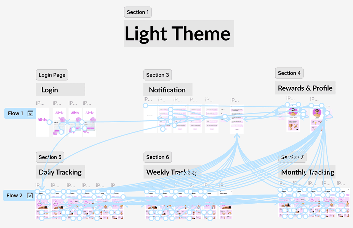
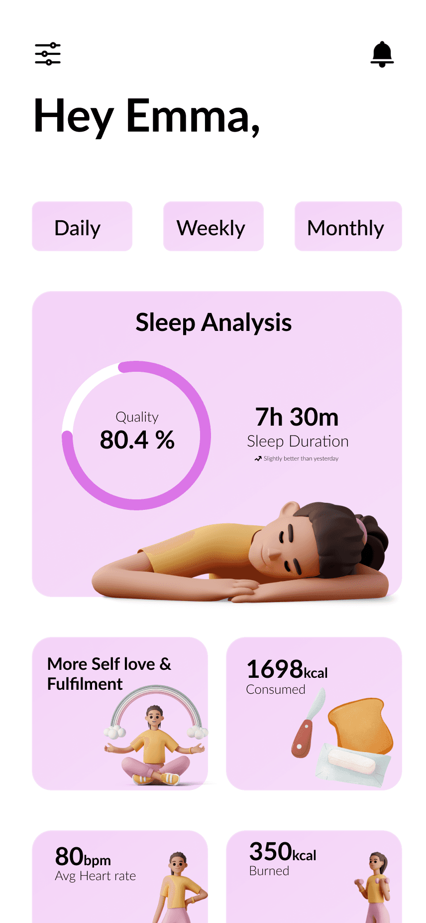
Light Mode
Optimized for daytime use — soft pastel tones, high clarity, and a sense of freshness.
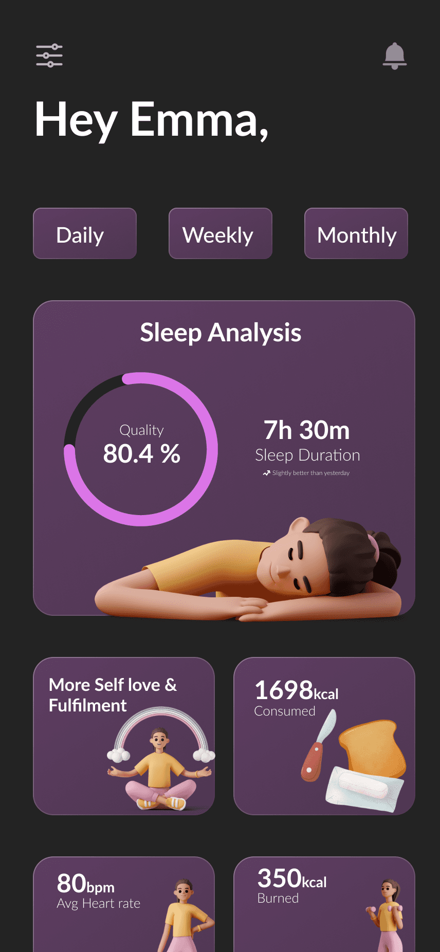
Dark Mode
Built for low-light environments — deep lavender and graphite tones balanced with accent highlights for calm focus.
Design System
Colors:
Light Mode: Lavender, blush pinks, white base.
Dark Mode: Deep violet, graphite, and subtle accent hues.
Typography:
Rounded, humanist sans-serif for legibility and warmth.
Components:
Cards, progress rings, and navigation elements built with scalable contrast rules for accessibility (WCAG-AA compliant).
Prototype
👉 View Interactive Figma Prototype
Outcome & Reflection
Delivered a cohesive, dual-theme wellness experience optimized for day and night use.
Learned how color psychology and accessibility affect emotional engagement.
Future improvement: introduce adaptive mode that changes with local time and ambient lighting.


