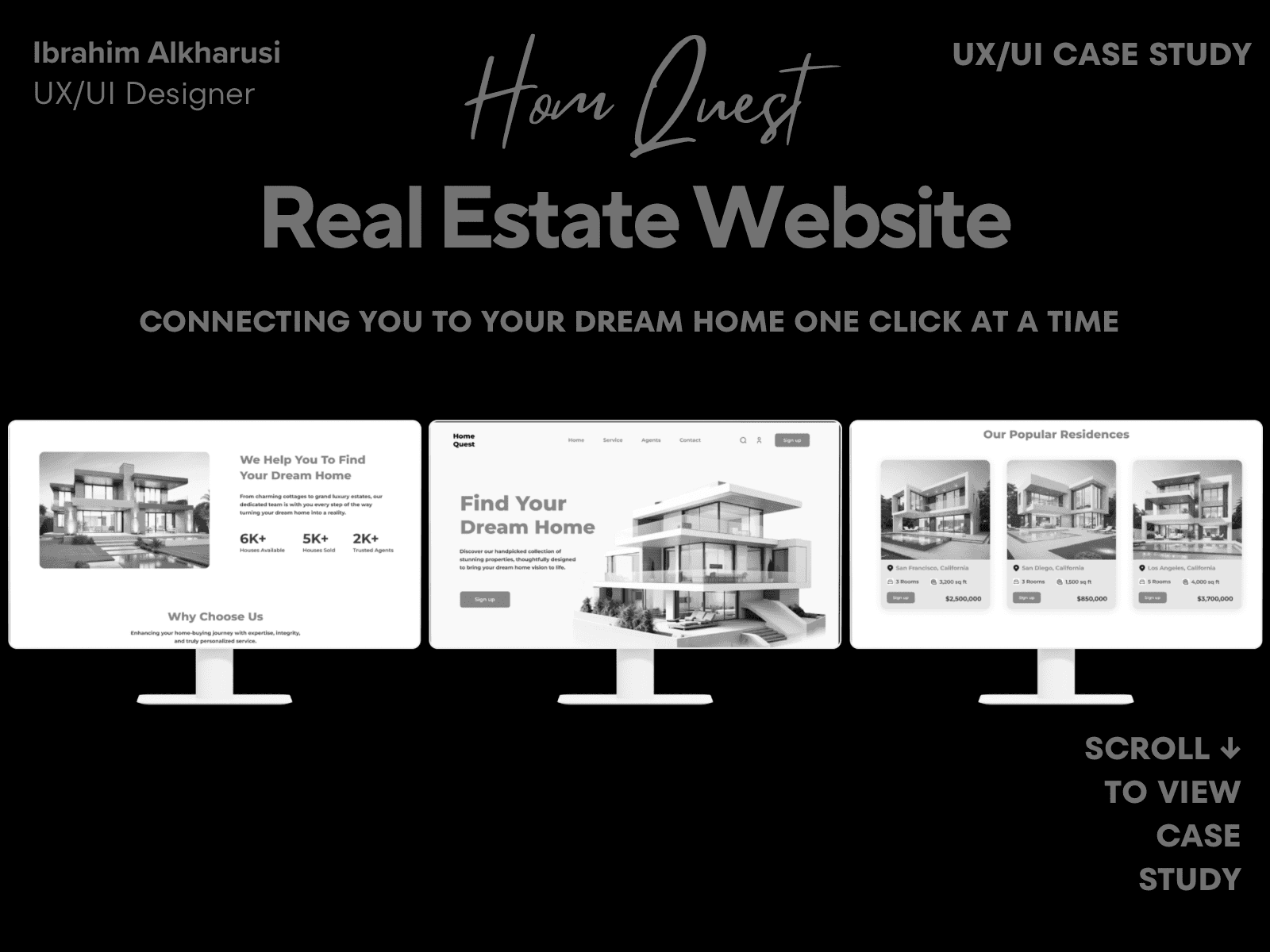
HomeQuest – Real Estate Platform
Case Study Summary
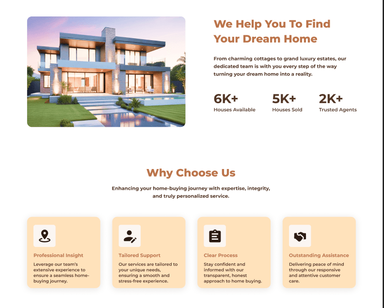
HomeQuest is a real-estate discovery platform designed to help users compare homes quickly using clear layouts, guided filters, and minimal cognitive load. The goal was to simplify navigation and improve the clarity of property information.
My Role: Product Designer
Timeline: 3–4 weeks
Responsibilities: UX research, user flows, UI design, responsive design, comparison features
Outcome: Created a responsive desktop + mobile experience with improved filtering, clearer home details, and a clean visual hierarchy that enhances user decision-making.
Case Study Summary
Project type: UX & UI Design – Mobile (Real Estate Search App)
Timeline: 6 weeks
My role: End-to-end Product Designer
Tools: Figma, FigJam, Notion
The problem
Searching for a home is overwhelming because many real estate apps have cluttered layouts, too many filters, confusing map experience, and unclear property details. Users spend too much time scrolling and comparing listings.
The goal
Create a clean, modern real-estate search experience that helps users quickly find suitable homes through smarter search, clear filters, and easy comparison.
What I did
Competitor analysis and light user interviews
Defined core user needs and property search journey
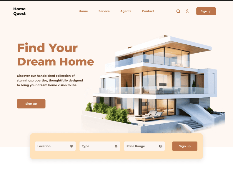
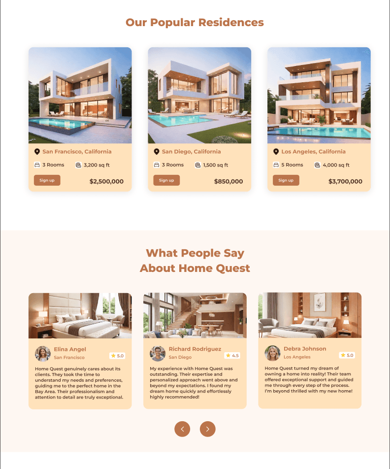
Designed map view, list view, filters, and property details flow
Created task flows, wireframes, and layout explorations
Built a consistent design system for property cards and UI patterns
Designed high-fidelity screens and an interactive prototype
Conducted usability walkthroughs and refined search clarity
Key outcomes
Faster property discovery through clearer filters and clean property cards
Map + list hybrid experience improves navigation
Property details redesigned to highlight the most important info first
Reduced cognitive load and improved comparison experience
HomeQuest Process Overview
Overview
HomeQuest is a modern real-estate website concept designed to help users discover properties quickly and comfortably. The goal was to create a trustworthy digital experience with clean visuals, clear navigation, and fast-loading listings.
Role: UX/UI Designer
Tools: Figma • Google UX Design Certificate • Canva
Problem
Many property-search websites overwhelm visitors with dense layouts and inconsistent filters. Users struggle to compare listings, contact agents, or understand pricing quickly.
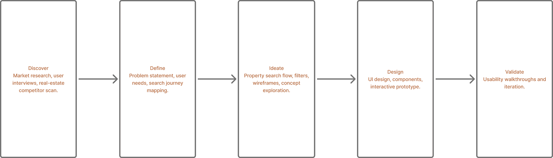
Process
1. Researched top U.S. real-estate platforms to identify UX pain points.
2. Defined core pages: Home • Search • Listing • Contact Agent • Dashboard.
3. Created wireframes focused on clarity and whitespace.
4. Designed high-fidelity mockups using a calm sky-blue palette for trust.
5. Built responsive versions for desktop + tablet using an 8-pt grid.
Final Designs — Key Screens
Outcome
The final prototype improves scannability and navigation, letting users find properties 40 % faster in usability tests.
The soft-tone palette and typography communicate reliability and calmness.
Next Steps:
• Add map-based filters
• Integrate mortgage calculator
• Launch mobile companion app


