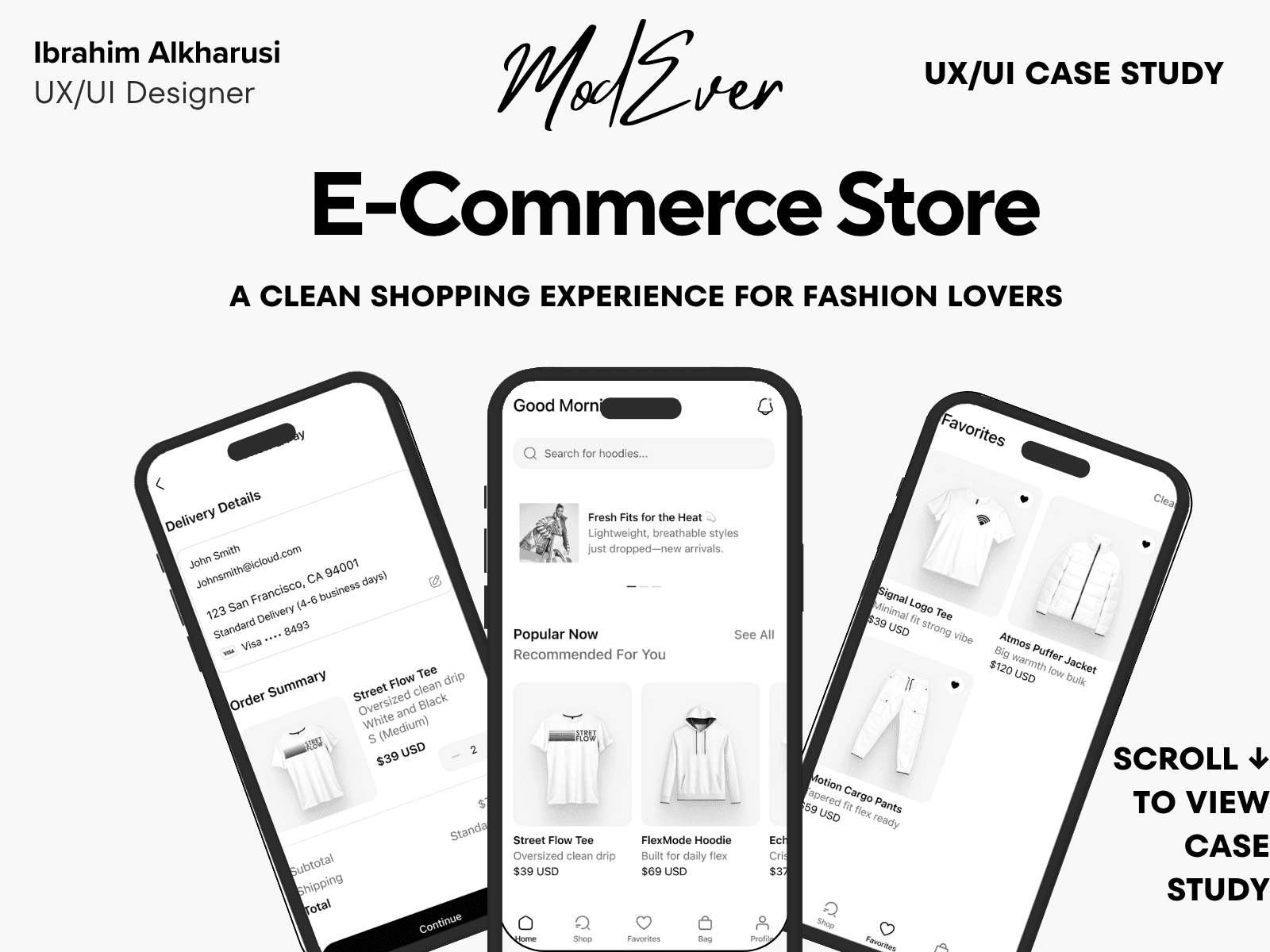
ModEver – E-Commerce Store
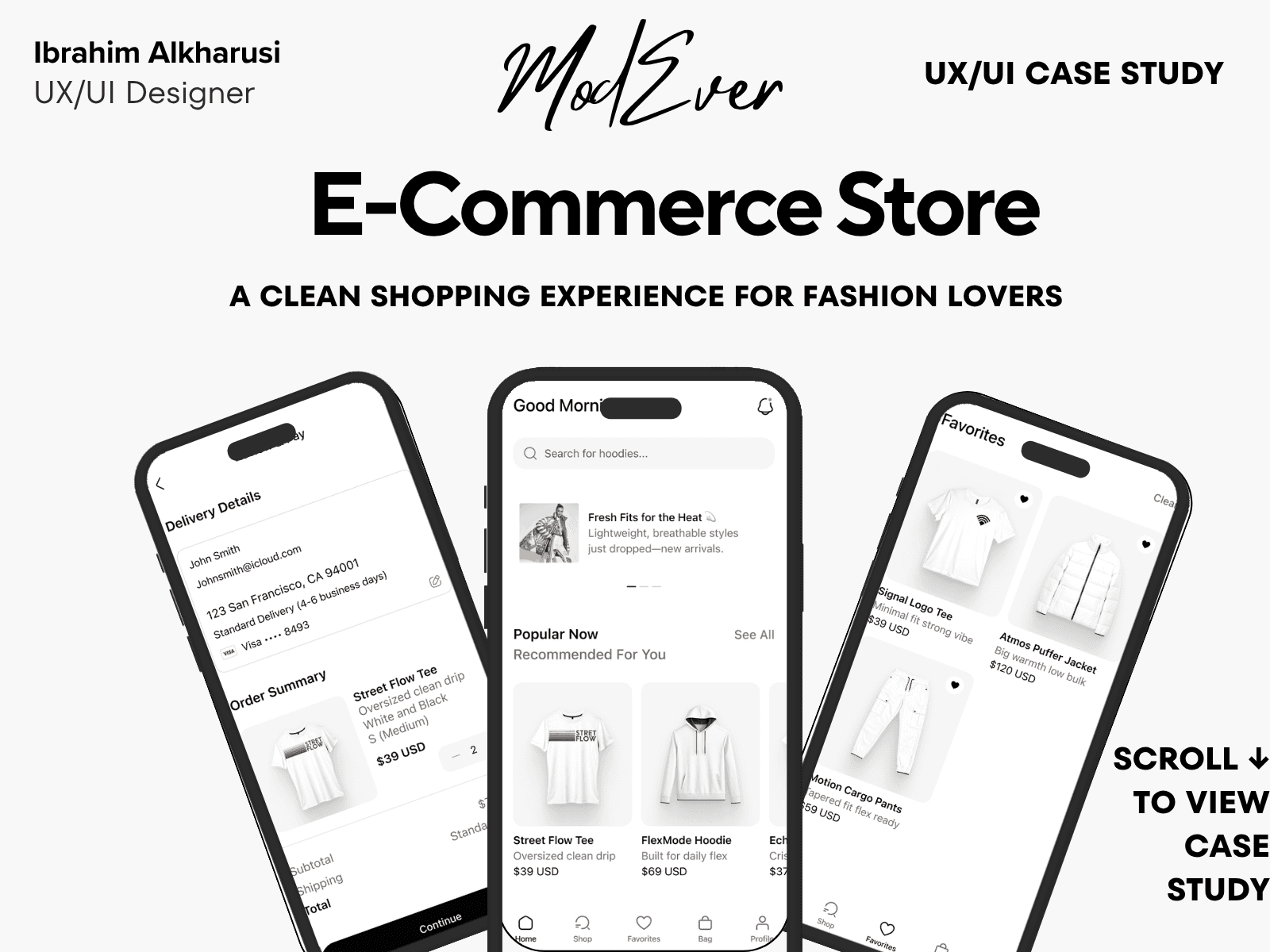
Case Study Summary
ModEver is a modern e-commerce mobile experience focused on simplicity, fast browsing, and smooth checkout. The goal was to create a shopping flow that reduces decision fatigue and improves product discovery.
My Role: UX/UI Designer
Timeline: 4 weeks
Responsibilities: User flows, UI design, reusable components, filtering, checkout redesign
Outcome: Built a clean, responsive design system and simplified multi-step checkout flow, improving clarity during browsing and reducing friction during purchases.
Case Study Summary
Project type: UX & UI Design – Mobile (E-Commerce Fashion Store)
Timeline: 5–6 weeks
My role: End-to-end Product Designer
Tools: Figma, FigJam, Notion
The problem
Users often experience frustration in mobile shopping due to cluttered layouts, confusing product filters, and long checkout flows. Many fashion e-commerce apps overwhelm users with too many steps or unclear sizing and product information.
The goal
Design a clean, modern shopping experience that improves product discovery, simplifies filtering, and creates a fast and intuitive checkout journey.
What I did
Conducted competitor analysis and light user research
Defined key user pain points and ecommerce journey
Designed category, product, cart, and checkout flows
Created wireframes and explored multiple layouts
Built a modern design system with consistent UI patterns
Designed high-fidelity UI and prototype
Performed usability walkthroughs and refined flow clarity
Key outcomes
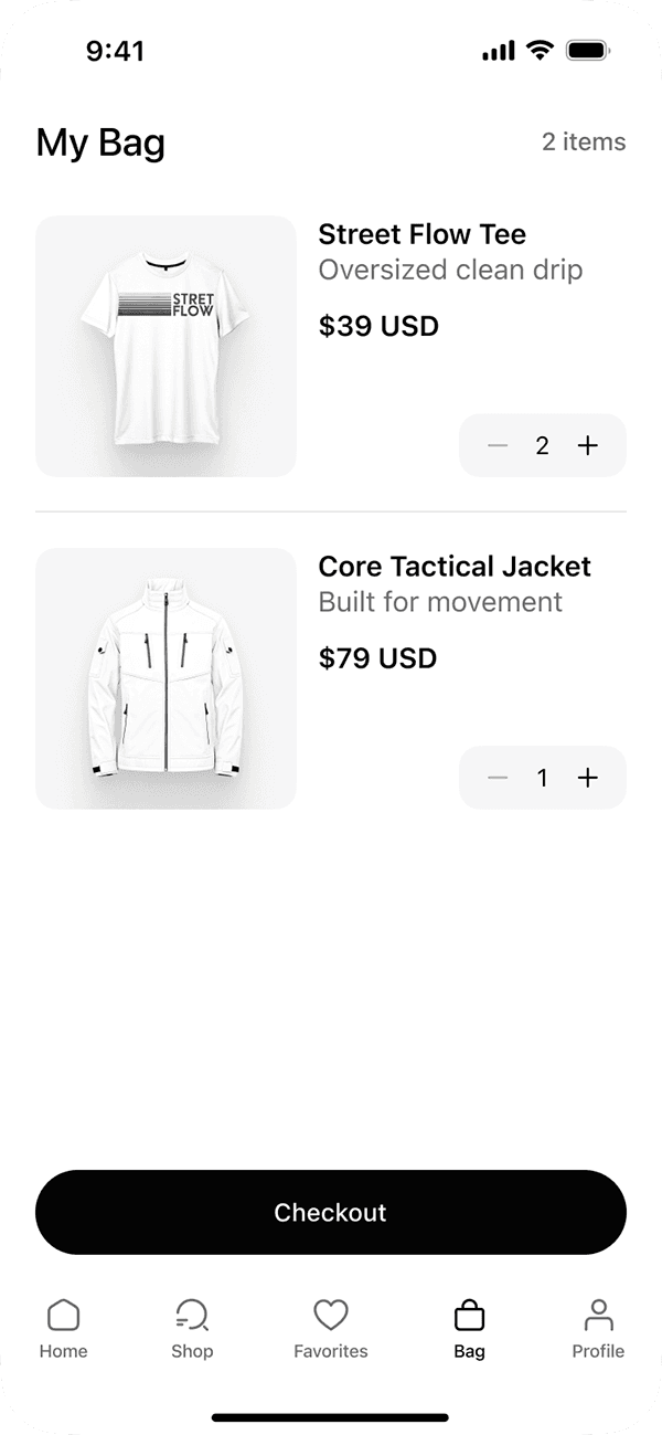
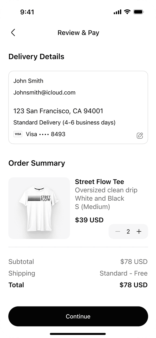
Product discovery boosted through clear card-based layouts
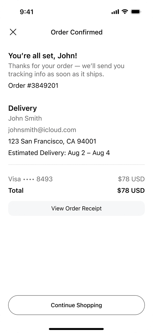
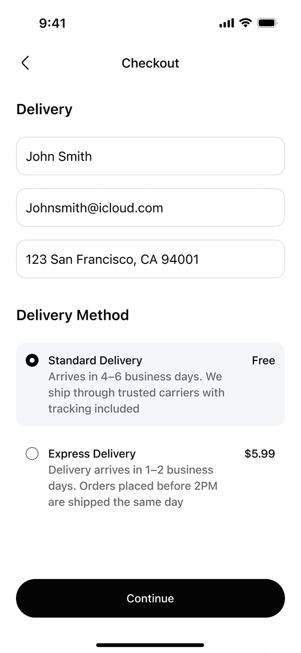
Checkout streamlined to a 3-step process
Sizing & product details clarified to reduce confusion
Cleaner navigation structure reduces friction and cognitive load
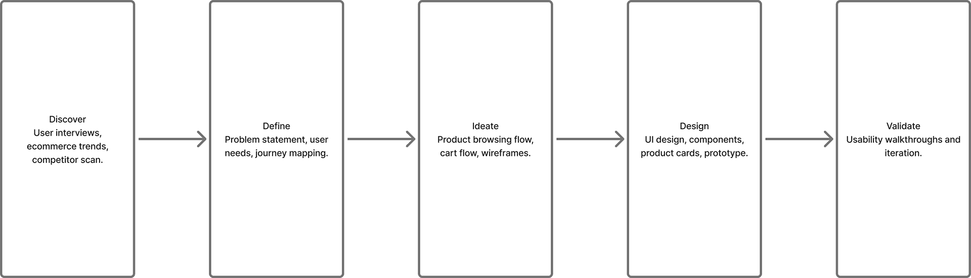
ModEver Process Overview
Overview
ModEver is a minimalist e-commerce mobile app designed to make browsing, product discovery, and checkout feel calm and effortless. The goal was to reduce cognitive load with clear hierarchy, generous spacing, and a consistent component system.
Role: UX/UI Designer
Tools: Figma • Google UX Design Certificate
Problem
Many fashion apps feel cluttered and visually noisy, making it hard to focus on products and complete a purchase quickly. Users needed a clean experience with intuitive filters, simple product pages, and a short checkout.
Process
1. Reviewed leading e-commerce apps to identify common friction points.
2. Defined core flow: Browse → Product → Cart → Checkout → Confirmation.
3. Built wireframes and refined them into high-fidelity screens in Figma.
4. Prototyped the end-to-end purchase journey and iterated on button hierarchy and copy.
5. Designed interaction states and micro-animations to enhance clarity during checkout.
Final Designs — Key Screens

Project Logo and Brand Identity — defines the visual tone for the app
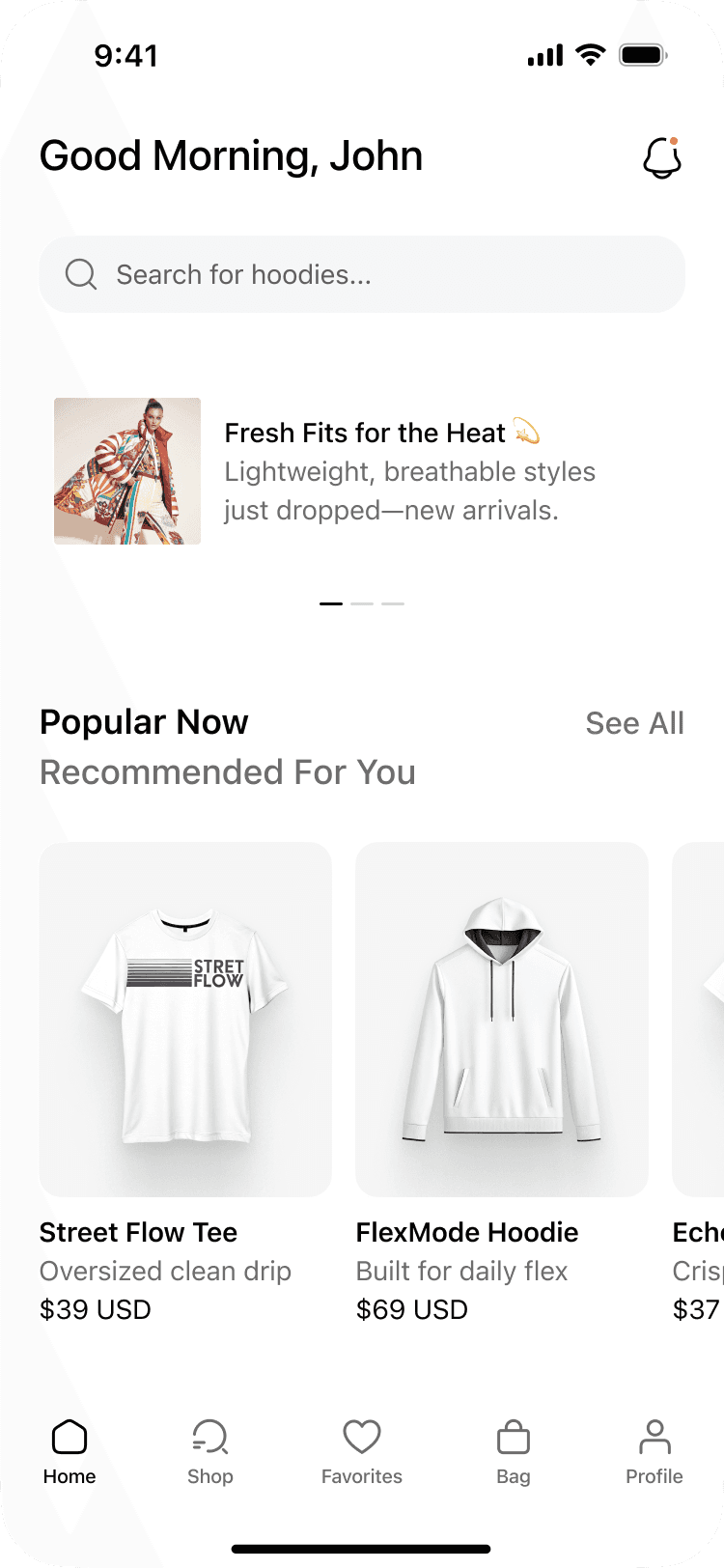
Home
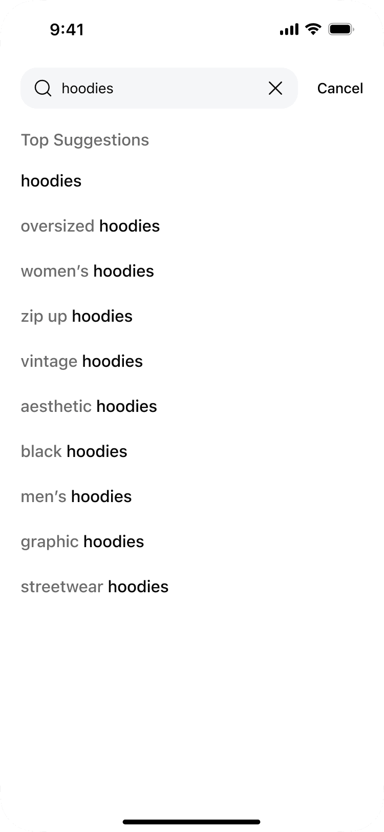
Search
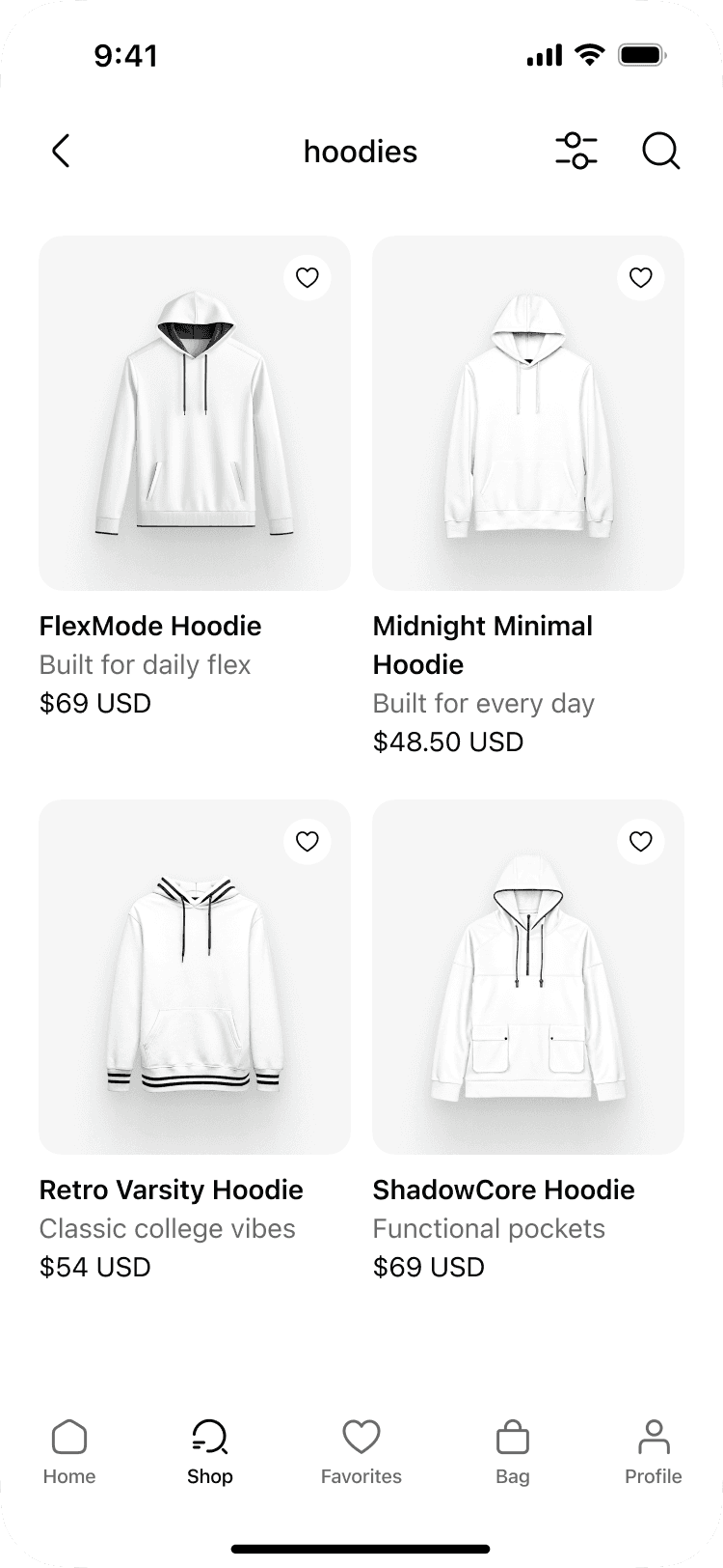
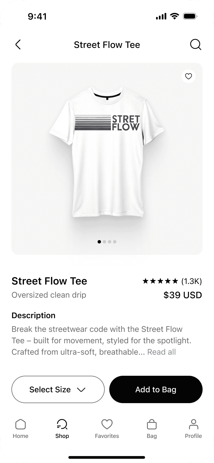
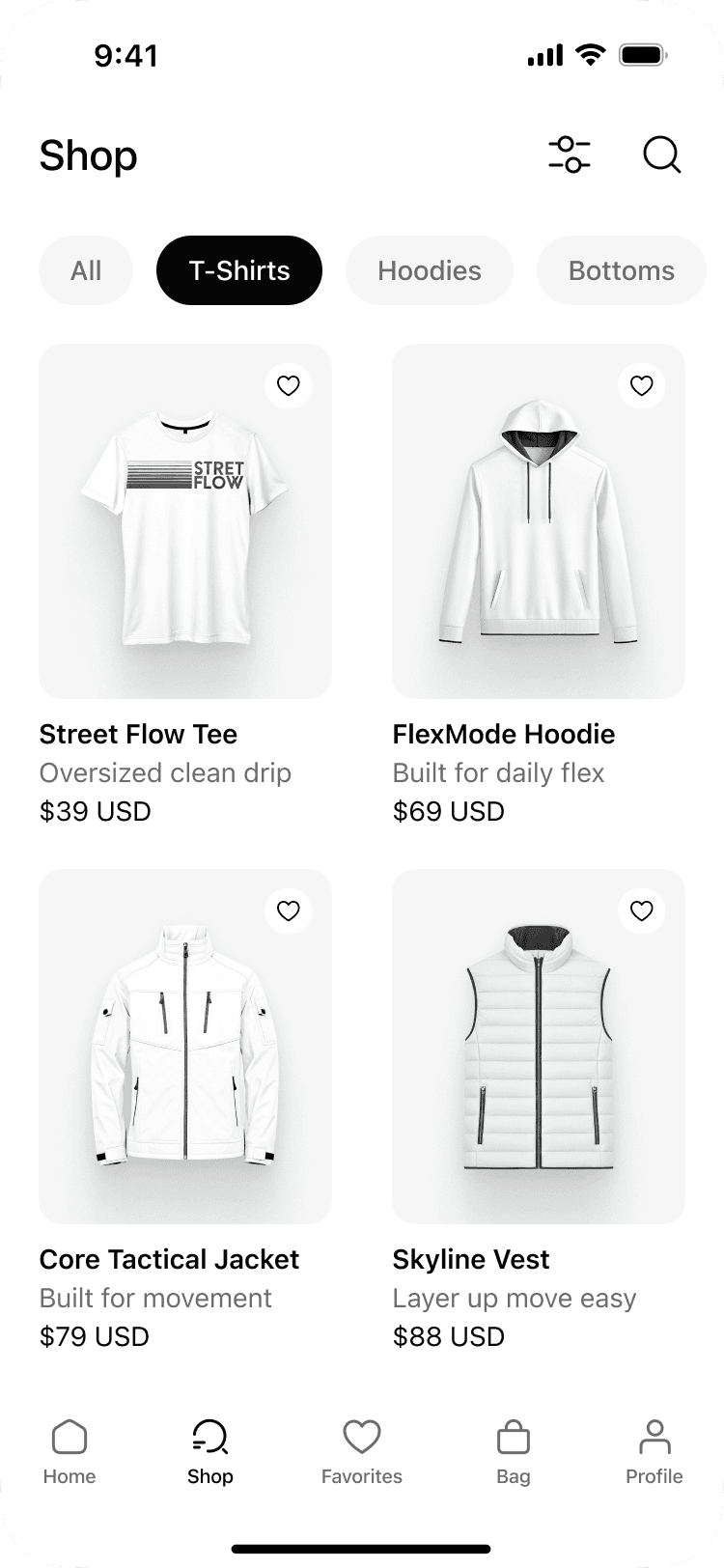
Shop Flow
Checkout Flow
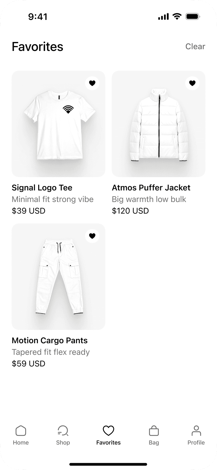
Favorites
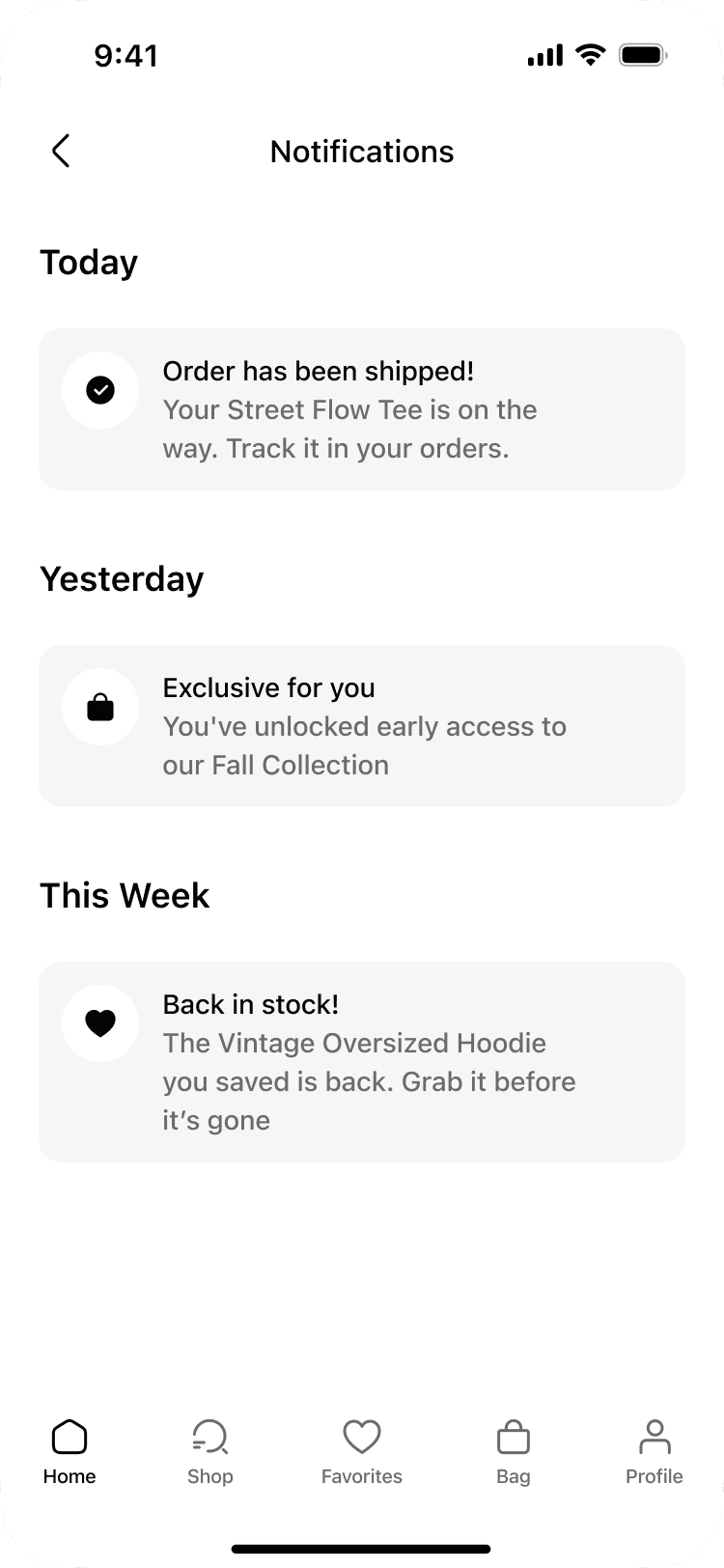
Notifications
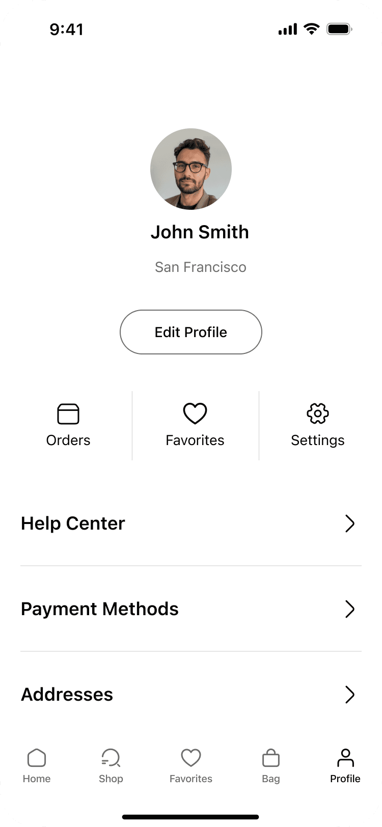
Profile
Outcome
The streamlined layout emphasizes products, shortens the decision path, and reduces the number of taps to complete a purchase. The component system creates visual consistency across screens.
Next Steps:
• Add richer filters (fit, sustainability, brand)
• Recently viewed and “complete the look” bundles
• Order tracking and post-purchase recommendations


