
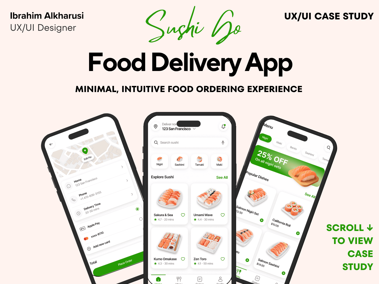
SushiGo – Food Delivery App
Case Study Summary
Project type: UX & UI Design – Mobile (Food Delivery App)
Timeline: 5–6 weeks
My role: End-to-end Product Designer
Tools: Figma, FigJam, Notion
The problem
Users often experience frustration while ordering food due to unclear item details, confusing customization steps, and long checkout flows. Many food delivery apps overwhelm users with cluttered layouts and too many options.
The goal
Design a simple, fast, and visually appetizing food delivery experience that makes ordering easier, reduces friction, and improves checkout clarity.
What I did
Conducted competitor analysis and light user research
Defined user needs for fast, clear ordering
Created flows, wireframes, and interaction patterns
Built a modern, appetizing design system
Designed all UI screens and interactive prototype
Conducted usability walkthroughs and refined steps
Key outcomes
Item customization flow reduced to under 25 seconds
Checkout flow simplified into a 3-step process
Clear, visual menu layout increased discoverability
Overall design focuses on speed, clarity, and appetite appeal
Design Process Overview
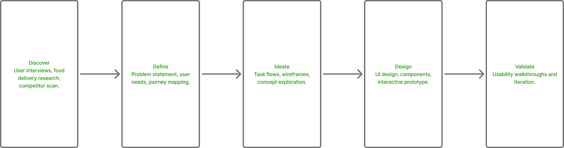
01 — Introduction
SushiGo began with a simple idea:
Ordering sushi should be fast, visual, and fun — not confusing or overwhelming.
Most food-delivery apps are overloaded: too many restaurant choices, too many menu items, and too many screens. When someone wants sushi, they want clarity, photos, and a simple path from craving to checkout.
SushiGo was designed as a focused, sushi-only ordering experience that feels delicious, clean, and effortless. This case study shares how I designed ShushiGo from early exploration to the final high-fidelity prototype.
02 — The Problem
Through early exploration of food-delivery patterns, I identified several issues:
Menus are cluttered and hard to scan
Users often guess what dishes look like
Customization options are hidden or confusing
Checkout flows are too long
App interfaces lack a visual food-first approach
Users feel frustrated when ordering quickly
For sushi in particular, visuals matter — color, freshness, shape — yet many apps fail to highlight these details.
The challenge was to design a fast, visual sushi-ordering flow with zero friction.
03 — Research & Insights
To better understand user behavior, I conducted 5 informal interviews with people who frequently order takeout, especially sushi. I also reviewed 3 competitor apps to identify gaps and opportunities.
What users said most:
“I like seeing the food clearly before ordering.”
“Too many steps kills my appetite.”
“I wish sushi apps were more visual.”
“Customizing rolls is annoying.”
Key insights that shaped SushiGo:
Use high-quality images as the core of the UI
Prioritize one-tap ordering
Keep customization simple and guided
Remove anything that doesn’t support speed
Make delivery tracking clear and reassuring
These insights helped guide every design decision.
04 — Defining the Goals
ShushiGo should:
Make browsing sushi fast and visual
Provide clear dish descriptions and ingredients
Offer simple customizations in one screen
Support quick reorders and favorites
Reduce checkout to the absolute minimum
Deliver a premium, appetizing visual experience
Feel modern, clean, and delightful
The overall experience needed to be smooth, encouraging users from browse → customize → order → track with no friction.
05 — Low-Fidelity Wireframes
I started by sketching the core flows:
Home (recommended rolls + categories)
Visual menu with large card photography
Dish details + customization options
Cart and checkout flow
Delivery tracking
Profile & order history
The goal was to ensure each step felt intuitive, especially for first-time users.
The wireframes helped me refine the one-tap add-to-cart and fast reorder system.
06 — Interaction Flow
I mapped out a clear, fast journey:
Open SushiGo
Explore visual dish cards
Tap → customize (optional)
Add to cart
One-screen checkout
Track delivery in real-time
This flow removes unnecessary screens and puts all key actions within one or two taps.
The goal was always:
“How can I make this faster?”
07 — Visual Direction & UI Language
SushiGo's visual identity is built around appetite appeal and clarity.
Core design principles:
Clean white & light backgrounds to highlight food
Strong photos as the main UI element
Rounded cards with soft shadows
Clear ingredient lists
Bold, readable pricing
Warm red and orange accents inspired by sushi tones
Smooth micro-animations on navigation and order actions
The interface should feel fresh, modern, and delicious.
08 — High-Fidelity Design
The final UI includes:
A polished visual menu with sushi photography
One-tap favorite & reorder buttons
Simple customization (sauce, extras, spice level)
Fast cart with item summary + quick edits
Clean checkout with minimal fields
Real-time delivery tracker
Light and dark theme exploration
A clean typographic system optimized for mobile browsing
Every screen is designed to reduce thinking time.
09 — Usability Feedback
I shared the prototype with 5 users and collected reactions to optimize interaction speed and clarity.
What users loved:
“This is so fast — I love the big pictures.”
“Customization is super clean.”
“Checkout feels really simple.”
“This is better than DoorDash for sushi.”
“The interface is just beautiful to look at.”
Improvements made:
Increased photo size on menu cards
Improved visibility of add-to-cart button
Clarified delivery ETA states
Simplified navigation icons
Made ingredient tags easier to read
These refinements made the experience even smoother.
10 — Impact & Learnings
Designing SushiGo helped me explore:
Food-first UI patterns
High-impact imagery integration
Designing for speed and appetite
Behavioral triggers around food ordering
Minimal checkout interaction models
Improving visual hierarchy for menu-heavy apps
Key learnings:
Visual browsing drastically speeds decision-making
Users prefer fewer steps, even if it reduces feature depth
Simple navigation is more important than advanced filters
Appetite-driven UI depends strongly on image quality
This project strengthened my visual, interaction, and UX reasoning for food-delivery interfaces.
11 — What’s Next for ShushiGo
Future improvements may include:
Smart recommendations based on past orders
Dietary tags (vegan, gluten-free, spicy levels)
Hidden gem rolls of the week
Table reservation feature
Group ordering for shared meals
Restaurant ratings and chef highlights
Gamified rewards for frequent customers
The long-term vision is to make SushiGo the most enjoyable sushi-ordering experience — fast, visual, and satisfying.
Below are the key screens and user flow from the Sushi Go mobile experience
Final Designs
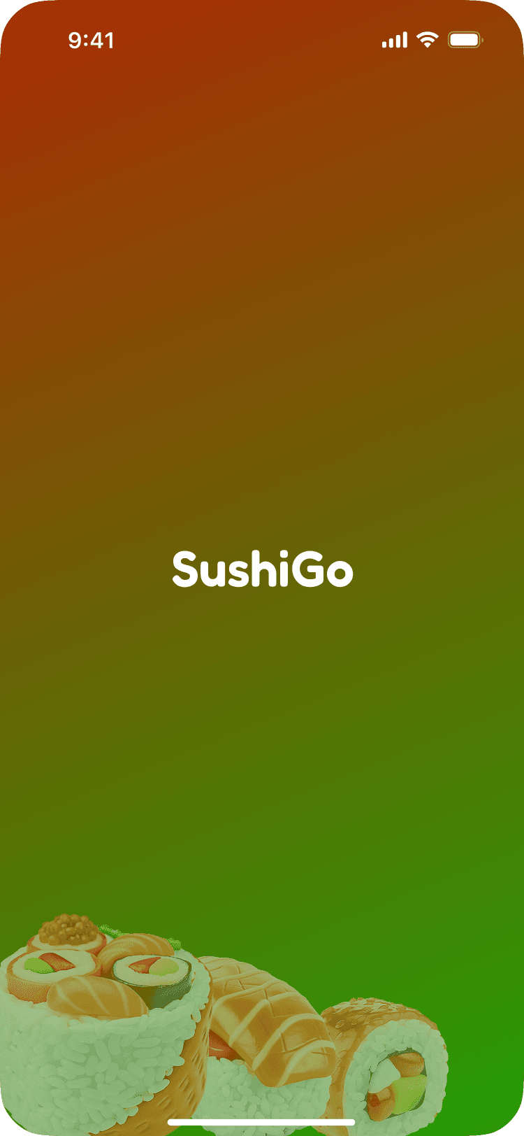
Project Logo and Brand Identity — defines the visual tone for the app
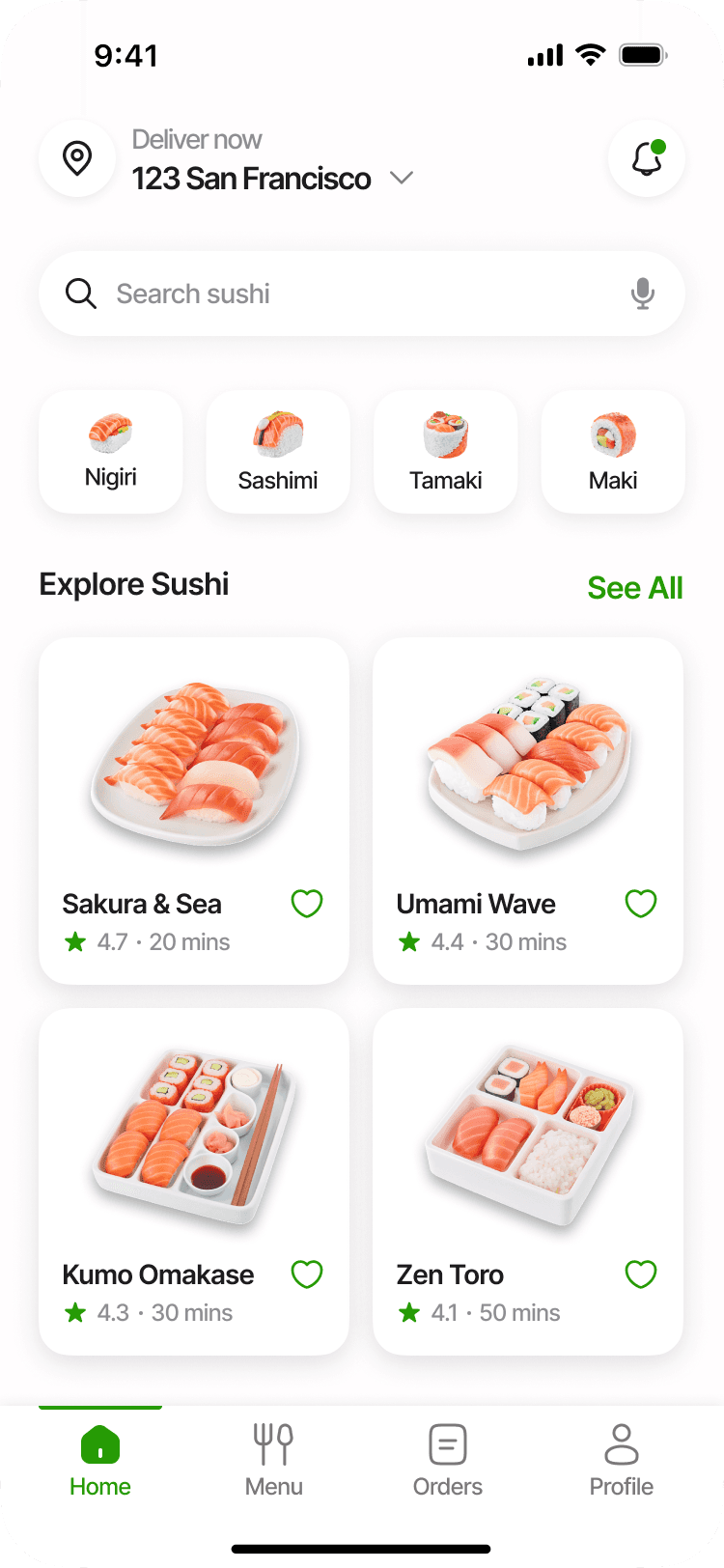
Home Screen
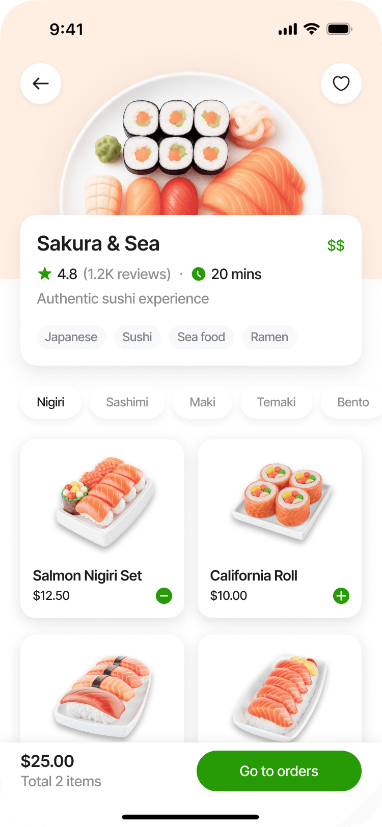
Product
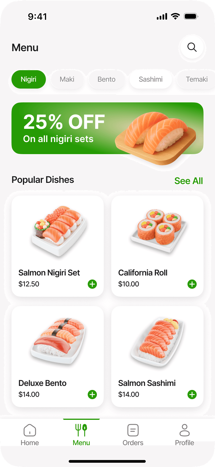
Menu
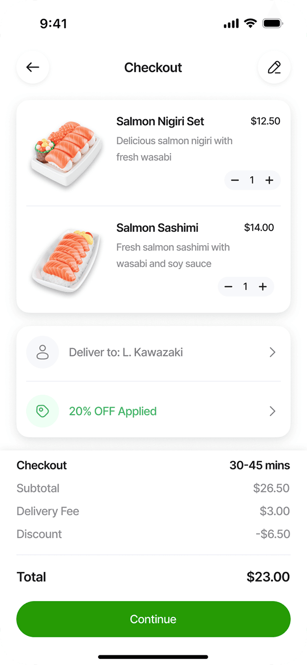
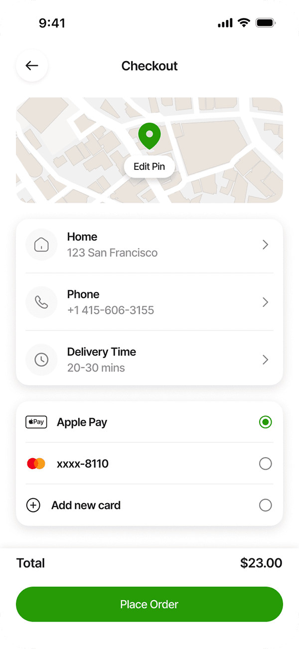
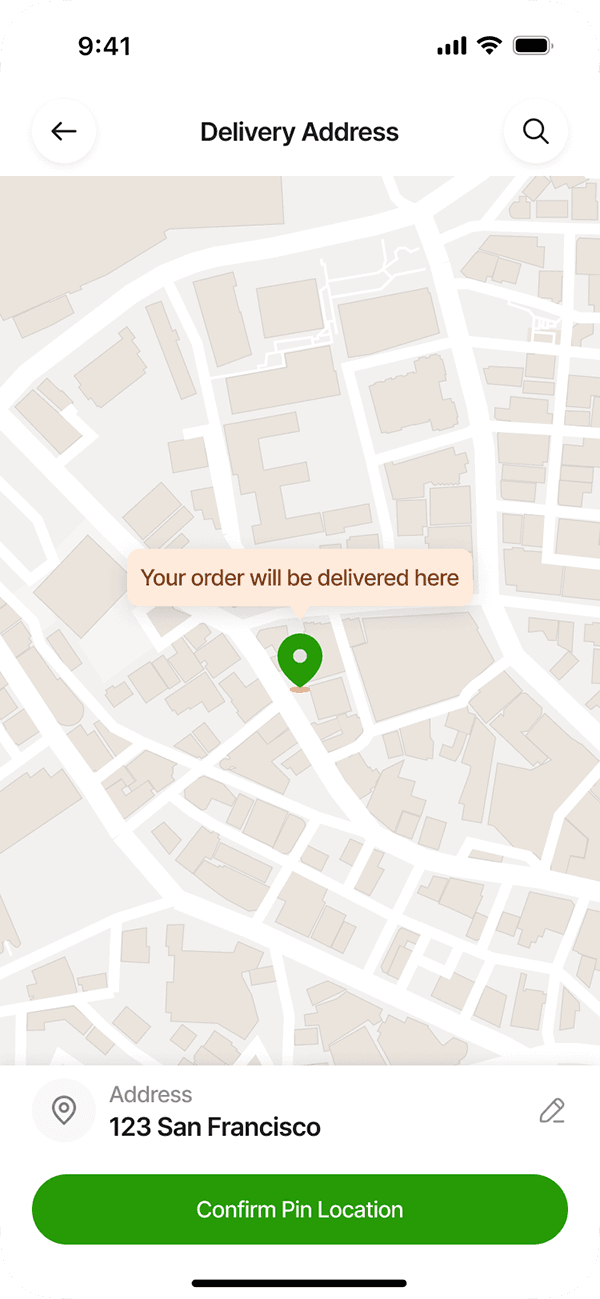
Checkout Flow, Payment, Address
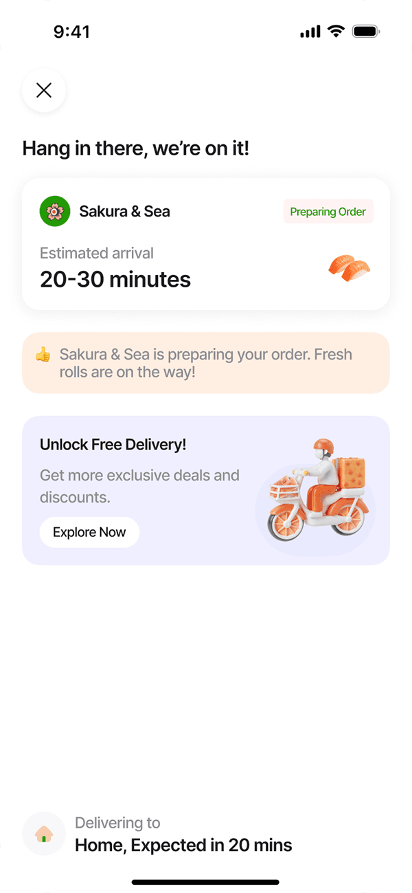
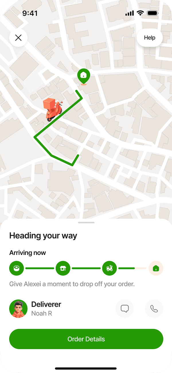
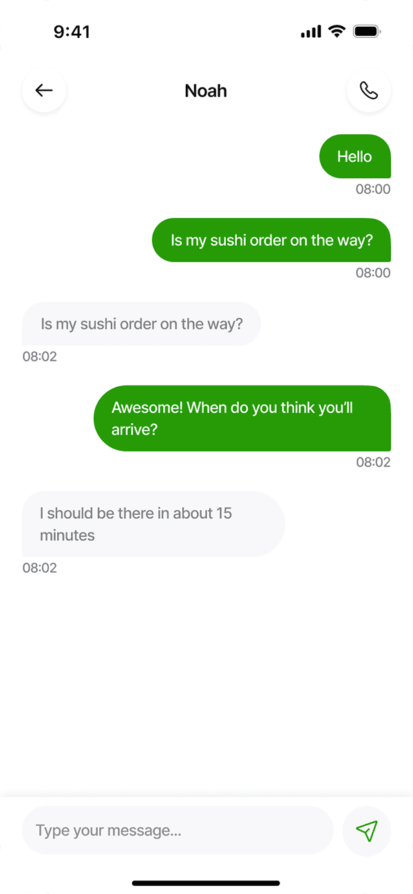
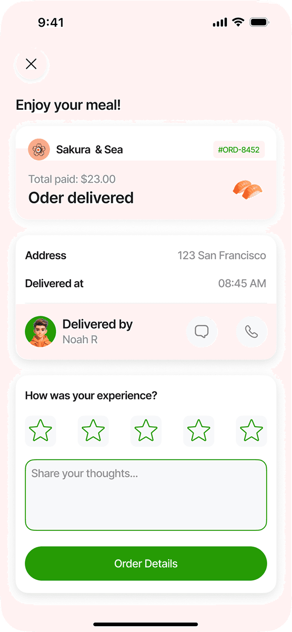
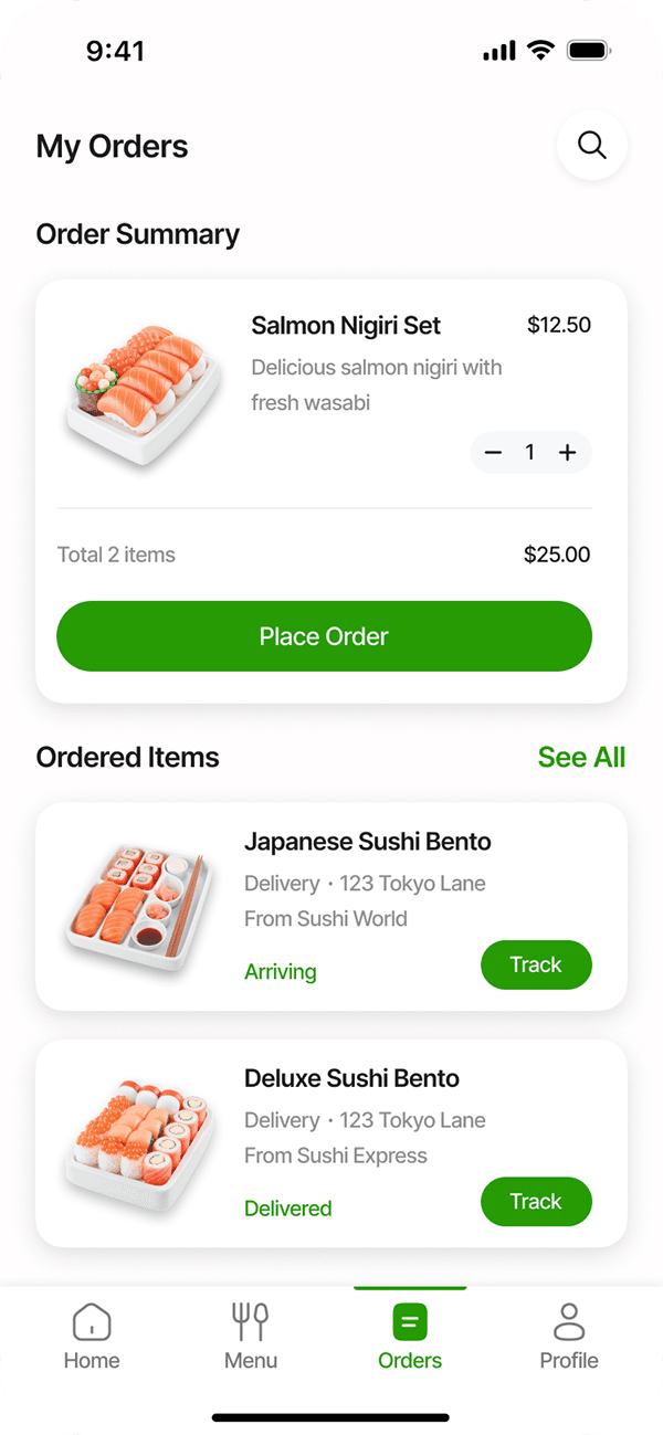
Track Order
Outcome
Users can now complete an order in 3 taps instead of 5. The refreshed layout highlights meals clearly and offers a simple, delightful user journey.
Next Steps: Add real-time tracking + personalized recommendations.


